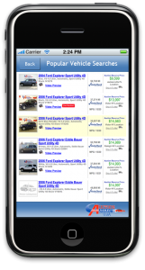
For about 8 years now I have been part of several teams that have built websites (different jobs, different projects) and one thing that I’ve noticed hasn’t changed in the digital world is the need to allow your users to get to their desired destination in less than 3 clicks. By providing your customers with a streamlined and logical website navigation, they should be able to navigate to what they need, from the home, in 3 clicks. That means you must organise your website content (known in the industry as information architecture IA) very well and sometimes put the user’s needs ahead of the company’s communication objectives. 
Website usability is a measurement of how well your website meets the customer’s needs and makes it easy for them to find what they’re looking for. Usability is closely aligned to user experience (UX), which is the art & science of designing websites with the user’s experience as paramount. A website with good usability is often very customer focused and always places the highest value on ensuring the customer journey is easy, fast and effective.
At present I am working on a large scale mobile site. In many blog posts now I have been recommending that businesses build their digital strategy around mobile. Mobile websites are becoming increasingly important as smartphones and tablet mobile devices are more commonplace. On my blog in April 2012 I received over 20% of visitors from mobile – many came from Facebook’s mobile app. Usability on a mobile is even more important because the screen is smaller and people’s expectations are different. Mobile phones are functional devices, but they are also connected to us for many hours a day and some people are incredibly emotional about their mobile phone, so you want them to have a good experience.

Usability is absolutely essential for your website or mobile site design. Ensure that you have a user experience expert included in the project
Mobile sites have a very different user experience to desktop based websites. They are truncated in nature, have less information/ words on their pages and their navigation structure is greatly simplified. However, people visiting a company website or eCommerce retail site, still want to be able to find what they’re looking for without having to click through a dozen pages to find their destination. By using the 3 click rule, you will improve your mobile website navigation and ensure that the end user’s experience is always in mind. This is not always easy to do but I recommend whenever you next build a website, a mobile site or an app of any kind, that you keep the 3 click rule in mind.
Tell me if you have examples of websites that have great usability and always allow the user to find what they’re looking for in 3 clicks or less.
