 Information Architecture (IA) is a somewhat scary sounding word that doesn’t immediately make sense to most digital marketers, let alone their traditional marketing colleagues – but they understand the term website navigation as they are familiar with this. It is easy to confuse one for the other because in many instances they are very similar, but this is not always the case.
For years now I’ve been working with clients in Sydney to guide them through the process of upgrading their digital marketing and communications so that they can better deliver to their customers needs and as a result, meet their business goals and grow their business. Often a significant part of the digital marketing upgrade Parachute Digital will recommend is a review of their website content (to be better received by search engines as well as being more engaging for the customers who visit) and sometimes a restructure of their website navigation and information architecture. First I’ll explain to you what these terms mean.
Parachute Digital’s definition of (Web)Site navigation
Website navigation is the tiered structure that a visitor uses to find content within a website. ‘Site navigation’ is the simple term often used to describe a website information architecture. They are slightly different in that the website navigation is what a user views as they move through a website. The information architecture is the structure of the webpage URL address and the grouping of content categories in the backend of a website system. A page can only exist in one location in an information architecture but it can be represented in multiple locations on a site navigation.
Parachute Digital’s definition of Information Architecture
A website’s information architecture is the process of developing the information or content structure of the site. Information architecture is concerned with the categorisation and naming conventions of a website navigation. The aim of creating an effective system for content or information is to ensure a good user experience for visitors navigating though the website looking for information. The design of a website information architecture usually takes place during the planning phase of a website.
Defining your website’s Information Architecture (IA)
The business process of agreeing a website’s information architecture can take dozens of versions. For a large-scale project, it usually begins with a digital marketing strategist or search engine optimisation (SEO) specialist carrying out some keyword research and trying to understand what type of keywords users are typing into the search engines looking for information that is related to your business/ website’s content. The SEO keyword research will identify which keyword terms are already delivering people to your business website. This research will also highlight the gaps in your current website’s content where keywords, which have a lot of searches, are missing from your website. This is the value that your digital marketing specialist offers you – the opportunity to be found by a much larger audience and grow the general awareness of your business.
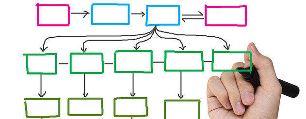
Once your have your list of keywords that you want your website to rank on page 1 of search engines for, you need to review your current website content and overlay these keywords with the content you already have, and create new content for the keywords that you are currently not catering for. The way we do this, is to create a IA map or information architecture tree (see the image below which represents this).

Example of the structure that an information architecture tree diagram might take.
The IA tree helps digital marketers group content into categories and start to represent how the user may move from one webpage to another – which can look quite similar to the final website navigation that web visitors may use. As we create more detailed draft of the website’s information architecture, the actual words that are used for each content category and the titles of the pages become more important as these “labels” should consider the target keywords that were identified in the SEO keyword research.
Your website’s information architecture and site navigation forms the backbone of your website and the way you categorise your content (for search engines and for the user who is navigating through your website) has implications for the titles of your pages (which indicates the primary keyword and information users can expect to find on this page) and thus the webpage URL address (for example www.yourwebsite.com.au/category/webpage-title) which should both be keyword rich. As you can imagine, there is often much negotiation between drafts between digital marketing strategists who are trying to promote the website as best they can for visibility with search engines as well as meeting the user’s needs first and businesses who want to promote their brand, agenda and be true to their internal context and language.

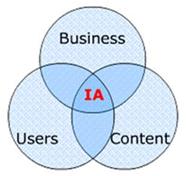
A good information architecture (IA) must align the business goals to the user’s need through content
The use of language and labels is often an area for much discussion when planning a website’s information architecture. For example, do we use the term “endangered species”, which users are typing into search engines, or do we use the term “threatened species” which is scientifically correct and how you may speak internally? This is where the website navigation starts to come into focus because the business needs to think about the user, the customer, what type of words they would be looking for when they’re navigating through your website looking for specific information. If you use the wrong word in the navigation, it could take them much longer to find what they want. We all want to have a good experience when we visit a website, we want to find what we’re looking for, quickly and easily.
Which takes me onto my next point. The user interface (UI), which is the actual functionality you use to navigate the content (be that a drop down menu, a horizontal navigation, a mega drop down or any other navigation functionality). You can have the best designed information architecture in the world, but if the website navigation is confusing and clunky, then your user is still lost and will find it easier to go back to Google to search for your information than find it on your own website. This exact scenario is something I’m working through right now with one of my clients.
So while a website navigation is technically different from your website’s information architecture, they are still formed from the same structure and using the exact same content and therefore promote the same keywords and use the same labels. The information architecture is hidden from plain sight and more important for the robots (search engines) who can see its natural order, while the website navigation is the first point of contact for human users visiting your website, and you need to please both audiences if your website is going to be truly successful.
Please, if and when you are investing in a new website design or content review, put the proper amount of time and effort into doing the research into your audiences needs and how they are finding your website currently, and develop a robust, well thought out information architecture so that your user’s experience of your website navigation, is excellent and they can find what they’re looking for, quickly and easily (by search, or on site).

I love to join this marketing