Less is More
Less is more – you may have heard that before? This time it’s about form fields on donation pages.
At our 2015 Donation Pages That Deliver breakfast events, we advised that you should keep the number of form fields to a minimum – 10 fields as a maximum. The more form fields you ask people to fill in, the higher the risk that your potential donor will drop off and gives his or her money to another cause.
In 2015 we didn’t have much data on donation page form fields – just a professional opinion. We looked for data, but there isn’t much available, let alone data about Australian donation pages. So we decided to do our own research to document what donation pages in Australia look like.
Now I’m almost finished analysing 103 donation pages on a strict and thorough criteria, including;
- payment gateways and ways to give
- form fields and user experience
- use of dollar handles
- images, videos and other content
- and of course how the single-donation experience varies from the regular giving ask.
I can’t wait to share with you a few of my experiences and insights.
Here is what we found.
Minimum Form Fields
We recommend that your donation page should have less than 10 form fields. But our research shows that the average number of fields Australian charities ask their donors to fill in for a one off donation is 19! 19 and of those, 15 are mandatory fields. That is 78% of fields are mandatory!
If you thought 19 was bad, I found twelve Australian charities that ask their donors to fill out 23 or more form fields.
Getting the donation vs data capture
It’s all about making choices and being smart.
Don’t try to get every detail about your donor into your donation page.
Of course we’re curious to know why donors choose you or if they want to make a bequest or where they would like their money to go. But it’s more important to get the donor to give and wait until after their donation before gathering this information.
Matching Donors with technology
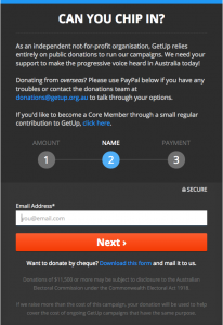
 When it comes to form fields, Get Up! really stood out (I have to exclude our own clients here). GetUp! have have kept their form fields to a minimum, and they start smart by asking for an email address. If your email address is already in their database, it will save you from filling out 3 more form fields.
Other organisations try to match donors with their existing database by asking for a donor or member number. No one knows this number or even where they may have it stored. It is a distraction and should absolutely be removed.
Validation of Form Fields
Two form fields that get special attention are postcode and phone number.
We checked if these entries were validated for Australian formats. The results are remarkable. Although not all charities ask for both data to be entered, only 14 charities validated the postcode field was 4 numeric numbers and another 14 that checked the phone number was 10 numeric digits.
Of those 28 charities who validated this information, only 5 organisations validated both.
This means 2 things:
- All the arguments that we need those extra form fields to match donors and have the most accurate constituent record are mute because the data is likely inaccurate; and
- You’re potentially wasting money in telemarketing calling incorrect numbers and direct mail where the letter will never arrive.
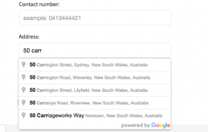
Only a small handful of charities use an address capture tool (like Google Smart Address) on their donation page. This will help you validate the address and reduce the number of form fields by at least 4, killing two birds with one stone.
Donation page form fields’ checklist
- Validate your data on the form, not after
- Pre-fill as many fields as you can
- Use numeric keypads for number fields
- Keep form fields on your donation page to less than 10 fields, because it will reduce drop off rate/ increase conversion rate
- Make it fast (which means easier)
- Add more touch-points into your donor journey to capture more donor data.


