Use PiktoChart (a free infographic tool) to use your business data to tell your customers a story without words
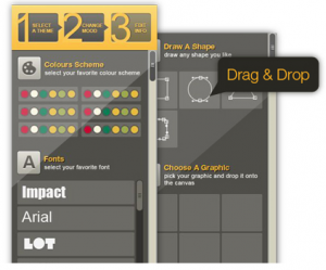
I came across this cool content marketing/ social media product that helps businesses create their own infographics – PiktoChart. I was planning on trying to make one myself, using my own website data to illustrate the point, but after looking at the How To Video (below) and actually considering how long it might take me to choose the interesting data from my analytics, I decided I couldn’t do it in the time frame I have available to me this morning. However, that doesn’t mean that you can’t give it a try! And I will update this blog post some time in the future to illustrate the point that it does look user friendly.
This video does over simplify the true art of infographics – which not every designer can master easily. Infographics use illustration, images and visual metaphors to explain text and data in an easy to understand and easy to consume way. I have come across many infographics in my time that do not add much value, are simply a bunch of images on a page with some words next to it that is supposed to mean something but I cannot for the life of me figure it out. Like the one below. How does a deck of cards represent Social Media? Bad infographics don’t tell the story, they’re just a distraction and create a disconnect between the words on the page and the images, often discrediting the basis of your content.

Infographics should tell a story and add value to your written content, when they are done poorly they create confusion and discredit your written work.
I’m a big fan of content marketing and of using infographics, but it has to make sense and the infographics have to be representative. In the Pikto infographic How To video example above they show four different percentages in the same size circles – this is not a good infographic. In you’re going to represent different percentages, then the circles should illustrate the relative size of the percentage from a whole (100%), so a pie graph or a small circle within a big circle for instance. Well, that’s one take on it.
Anyway, I’m sure PiktoChart is an excellent infographic tool if you have some design skills and you understand the intent behind using an infographic in your online content marketing. So get some company data that you have invested in researching but have never used it, sit down with a designer and try to figure out how this information could be of use and what type of graphical illustration will best tell the story – and good luck!
