Building a website can be expensive. To do a good job, a business must put aside some time for research and planning to ensure that you’re targeting the right people with the right message to get them to do what you want them to do – namely, act (buy, subscribe, interact). When planning the “what you want them to do” part, you need to make sure that your website has the right functionality, tools and information to support them the user in performing the task you want them to do. Then you need to have the right business systems and processes behind your website so that you are able to fulfil your promise to the user – they have acted as you wished, now you need to respond with information, product or content.

A user’s experience is dictated by the journey they take through your website and how easy it is for them to achieve their desired outcome
Building a website is usually broken into the following stages:
- Research and Planning – scoping & requirements gathering for future phases
- User Experience and Design – determining the journey the user will take through your website to perform the desired action
- Website Development – building the experience and making all the parts come to together (html coding)
- Testing – making sure that the website performs as a user expects it to based on the desired action
- Launch
In my experience, most businesses know about the website research and planning stage but spend far too little time on it and even if they’ve thought about it, they don’t document it. User experience is skipped all together and they move straight into design. If you design a website based on how it looks, you will always miss vital elements that are needed to drive the desired action of your user. Website development is a given, you can’t build a website without html code being placed into the internet. And testing, often small businesses are so eager to get their website live that they don’t properly test that all of its functionality works as it is supposed to. When budgets are tight, the desired testing is often the first item cut, this leads to many more months of poor user experience while you wait for your customers to tell you the problems.
If you want to build a website that gets it right the first time, that delivers a strong and expected experience for your customer, you will convert visitors to customers much faster and at a lower cost.
So, in the digital world, what is user experience and how does it fit into the planning and building of a website?
Wikipedia defines User Experience (UX) as “the way a person feels about using a product, system or service. User experience highlights the experiential, affective, meaningful and valuable aspects of human-computer interaction and product ownership, but it also includes a person’s perceptions of the practical aspects such as utility, ease of use and efficiency of the system. User experience is subjective in nature, because it is about an individual’s feelings and thoughts about the system. User experience is dynamic, because it changes over time as the circumstances change.”
I would shorten this to say, User Experience (UX) is a specialised skill within website development. User Experience experts or architects have the ability to understand how users/ consumers/ customers behave when interacting with websites and they are able to better design a website or system to best meet the users needs and expectations, to ensure that they have the most streamlined and positive experience.
What I like about the wikipedia definition of user experience is the reminder that UX is forever changing. Once a website has been developed, with all the best practice user experience planning and design, it still has to go through user testing to make sure that the website fulfils the promise it makes to its end user and that they understand the desired action they are supposed to take and that they can perform this action with relative ease. If the testing proves that this is not the case, then the user experience architect will return to the wireframes (I’ll explain later), makes some changes that are then added into the developed website that will hopefully improve the user’s experience and help achieve the desired outcome.
This processes of design, build, test, refine is never ending in the digital world, it is called usability. The best websites are always testing and optimising their websites to get the best possible user experience which usually results in the best possible sales, the highest possible visitors and the most liked websites. When a client asks me to review their website, often its a specific request to understand how they are performing for search engine optimisation (SEO) or to audit if their website and email subscription systems are privacy and spam compliant, but I will always assess the usability of their website and make recommendations for changes that will improve their users experience and thus make their digital marketing strategies, such as email and search engine optimisation (SEO) more efficient, in both cost and time.
A websites usability is not something the user should ever see or understand. If a website has been designed with strong usability the end result will be comments from users and customers to the effect of “the website was really easy to use”, “I was able to find what I was looking for quickly”, “the website seemed really intuitive and easy to navigate”. If the user has a bad experience, well, I don’t need to tell you how they react – public complaints on facebook, frustration that leads to negative word of mouth spreading and a bad reputation and worse.
So, how do you ensure that you have built a website with good usability?
In the planning stage, make sure that you have fully explored and documented who your customer is and what action you want them to do on your website. For some businesses this is simpler than for others. The fewer actions you ask of a user, often the better the usability will be as it should be less complex. If your website is about information, then your information architecture or website navigation is going to be of utmost important. If your website is an eCommerce shop and you want your customers to buy products and services, then the shopping cart and purchase process is going to be of utmost importance.
Did you know that on average the online shopping cart abandonment rate is almost 64%? By investing in strong user experience planning before the design stage of building your website, you could reduce this rate hugely. Of course, there are other online marketing tactics that you can use to bring abandoned cart customers back to your website to complete the transaction (trigger based emails etc) but that is another topic entirely.
Anyway, I should have detailed this much higher in the blog post but better late than never.
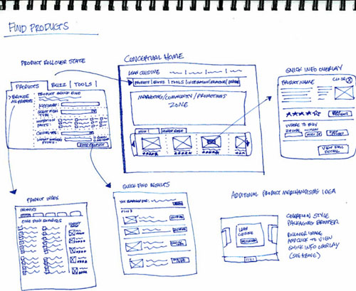
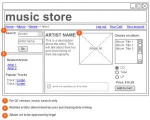
In the planning of a website, User Experience would usually come pretty early, after the initial business plan and scope of the website has been agreed, but before the content has been finalised or the design made. A user experience architect usually works on detailed wireframes that map the layout of every webpage on your site and highlight what each element on the page is supposed to do and how it will function. It is at this stage that the business should ensure that all necessary information is presented or captured, that the website functionality performs as it should and that no holes are left. fpn
Of course wireframes are still designed by humans and we still miss elements every now and again, but the success of your website and the ability to create a positive user experience that delivers the desired action faster and more easily, is more likely if you invest in usability planning than if you did not. It’s never too late, if you did not take usability into account when you first built your website, perhaps its time for an upgrade. If you need a good user experience architect in Sydney, let me know and I can recommend a few to you.


Great blog. Your article is a good start for everyone who wants to know more about usability. And yep, we’re not based in Sydney, but in Wellington and we’re also very passionate about UX.