It’s A Wrap! Christmas is over, so who made us give?
 With 2017 into full swing, I wanted to take some time to look at some of the Christmas Appeals of 2016 before I gallop full steam ahead into all the amazing projects about to kick-off this year.
My inbox has been a flurry of activity over the festive season from charities across Australia and New Zealand all gallantly vying for a piece of my pie.
Although there were hundreds (yes literally) I’ve picked out some that stood out (IMO) from the crowd.
Give It To Me (Or Them) – Oxfam the winner
Countless charities went with the old tried and true gift options this Christmas. With Compassion Australia initially focused on flogging bibles (and sending many EDMs that I couldn’t possibly miss out), then took a more general focus on buying goats, chickens etc, (I presume to appeal to the broader market/gift recipient).
They also had an Ethical Christmas Gift Guide, which I thought was a really handy guide to make sure I am making sensible choices for my loved ones/the greater good and the environment. They even sent me an EDM with a poem about buying gifts on Christmas Eve!
Others such as Bush Heritage, Unicef, and World Vision Australia also focused on gifts (plus much more).
My fave Christmas appeal of 2016: But the one Christmas gift EDM that really stood out for me as quirky and a little different was from Oxfam New Zealand who was having a half price sale! Even the CTA was retail focused asking me to ‘shop the range’! This was certainly different and I’d be really interested to see their results compared to previous years.
Show Me Where My Money Goes
A plethora of charities used case studies to show the recipients where the money goes, where the shortfall is, and how their work has made the difference to peoples/animals or the environment. The case studies were told from several viewpoints and came from a mix of CEOs, Case Workers, and the individuals themselves. These EDMs really did connect with my heart, mind, soul, and wallet. The stories resonated with me and I felt the desperation for my help. Believe me, I really wanted to help.
Video Captures The Spirit
Many charities used video content to tell the story on the landing page which was really strong and brought the story to life. Fred Hollows Australia did an excellent job of this as did Red Cross Australia with a powerful video of Lilyana who was reading one of the messages of hope she had been sent. Plan Australia created a wonderful warm fuzzy feel good video to support their Appeal too.
Ho ho huh?
There were even a few charities who didn’t even mention a whisper of Christmas in their Appeals, namely The Wilderness Society who stayed firmly focused on keeping BP and any other oil company from drilling in the Great Australian Bight, and the Malala Fund who stayed true to their mission to give every girl equal rights to an education. But they worked. I knew it was Christmas so why bang on?
Best Mobile Experience – Pay with PayPal
This has to go to The Malala Fund who use PayPal as the default payment method for donations (if you attended our last donation page research seminar you’ll know how important PayPal is to Australian charities. Here are the slides if you want to see how important it is to give your donors options for how they pay online) and also included FAQs about the security of donation payments made on their website. A really neat and well-executed appeal/mobile experience.
Use of Imagery
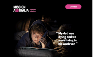
Powerful imagery rules with digital and Mission Australia and Oxfam Australia did a fantastic job of this. However, Plan Australia out-trumped them all. Cheery, happy, smiling kids in every photo and video greeted me. The uee of bright colours and good design led me on my journey to their donation page without feeling guilty or sad. Great work.
Best Use Of Technology – Personalised URLs
I am biased, but I think they did an awesome job this year in the innovation stakes. Anglicare sent out a series of EDMs to support their DM activity, with a selection of the EDMs getting a personalised URL (called PURLs). These URLs held details about the recipient in the query string (all perfectly safe and secure from prying eyes) and pre-populated the donation page for them!
Here is an example of how the Anglicare Donation Page was personalised for Stacey Thomas.
The URL also pulled through the previous donation amount (and a bit extra) too, just to help speed up the process and decrease the likelihood of churn on the donation page. Genius. (Pats Parachute Digital on the back.)
Let’s see how much we can grow in 2017
So that’s 2016 all wrapped up and I look forward to working with more wonderful charities this year helping to increase your digital donations and work on some cool campaigns too.


