To have a successful digital fundraising strategy, organisations need to get the four fundamentals right
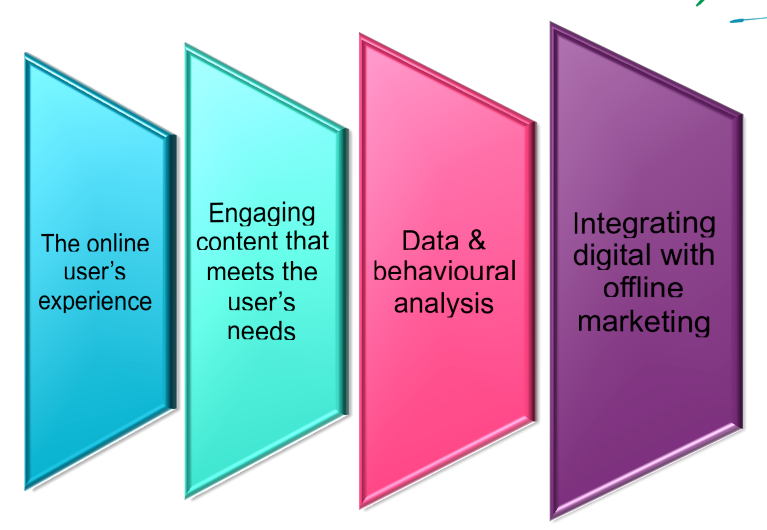
Regardless of your organisation’s cause, objectives or audience, there are four fundamental elements you need to commit to for a successful digital fundraising strategy; User Experience (UX), Content, Data & web analytics and Integration. Today I’m going to talk about two of them – the user’s experience online and how content helps to shape that.
I believe that there is no longer any excuse for a poor online experience. Consumer access to the internet is two decades old, every home has had a personal computer since the millennium, dating and shopping online are common-place and most of us own one, if not two, internet enabled mobile devices – and have for a couple of years now.
For too long non-profits has been lagging behind our corporate competitors, insisting that ‘donors don’t want give online’, let alone via a mobile phone, and using this as justification for a lack of investment in digital fundraising and quite frankly a lack of innovation.
It must stop.
Donors are trying to give online
In recent years, a plethora of global natural disasters, a rise in event and peer-to-peer campaign fundraising and a distinct growth in online revenue for non-profits has more than proven that people will and are giving online. How much they do so is largely dependent on how easy you make it for them.
I just completed my first #CanToo Ocean Swim, raising money for Cure Cancer, on Australia Day 2014. I signed up to the swim program in November 2013 and began fundraising – mostly through my personal and Parachute Digital’s social media networks. As this was my first time fundraising for a personal cause, I was astonished to reach the $1,250 target (that #CanToo set for me) with only two Facebook posts. However, I did receive several comments from friends saying that the Go Fundraise platform wasn’t mobile friendly and that they would donate later. It’s no surprise that most of these people never did get round to donating – not because they didn’t want to, but because it was too hard to do it when they had the moment of inspiration.
Make it quick & easy for the user
Cure Cancer lost precious dollars because they chose to facilitate their donations through a platform that has a poor mobile user experience. The Go Fundraise desktop user experience isn’t so bad. It’s a one-page process – which is best practice. There are some redundant data fields in the form (repeat email, title and state) but the user does have the option to log in with Facebook to save filling out all of the form fields (and make it easy to share your good deed with friends later). And the credit card requirements are industry standard with the all important visual cues to confirm the gateway is secure.
But on a smartphone, it’s a different story.
The website isn’t using a responsive design and regardless of what some developers might say, simply shrinking the page does not qualify. The user has to pinch and expand the form to be able to ‘click’ (with their fingertip) the radio buttons and enter information into the form fields. And trying to tab through the fields proved problematic.
The Go Fundraise website has not taken steps to create a mobile-friendly version of their donation portal. And this seems an unforgivable oversight considering that revenue for peer-to-peer fundraising (of which the #CanToo program is one of) is now driven largely through sharing social media.
Mobile and social media are absolutely intertwined – one does not exist without the other any more, so this is a considerable error in the CanToo and Go Fundraise digital strategy.
Giving your donors a good experience, on every internet-enabled device, is essential to online fundraising success. You need to make sure that it is quick and easy for your supporters to give online – if its not, then you’ve lost them, possibly forever.
Content is at the root of everything
Your online supporter’s experience expands beyond the infrastructure and functionality of your website or mobile application. How you’re able to connect with and engage your audience is largely dependent on the stories you tell them. This should come as no huge revelation. Surely, it’s no different online for a direct mail or direct response TV ad (DRTV).
In my #CanToo example, the target audience were my friends, colleagues and clients. Many of them knew my story, but hadn’t been reminded of it for over a decade. While for others, some who have known me all of my professional career, it would have been a glimpse into my soul. My goal was a donation, so I used emotive language and images to draw them in and empathise with me. Over the course of my training and fundraising campaign, I continued to share more stories and pictures of my youth as well as my swimming progress via digital channels.
Content is at the root of everything online. If you build your digital strategy and fundraising around content, you’re better able to manage the consistency of the messages your supporters receive. It will also provide you with an infinite distribution (and organic acquisition) channel. The stories you tell and the way you tell them, using real life case studies with words and pictures and videos and interviews and surveys and research to support them, will be so much more compelling. It was the content that I shared that enabled me to double my revenue target.
Once you’ve decided on the story you want to tell supporters, it’s about creating a library of assets to create a multi-layered narrative that evolves over time through multiple channels. Regardless of which touch-point your donor lands on, they will get a new piece of a familiar story.
Online allows you to automatically trigger and sequence your story so that it expands and engages the donor over a specific period of time, taking them on a deliberate and emotional journey. Or you can design a non-linear narrative where the donor can discover a new piece of information, and the story makes sense regardless of what order they come across the individual chapters.
Building engaging digital content for your website gives you an ideal destination for your email fundraising, your social media marketing, for people looking for information (you have) in Google’s search engine. You can direct supporters to your online content to give or take action from DRTV ads, from direct mail letters, from mobile SMS messages, at events and when engaging with prospects face to face.
Digital is not a silver bullet
Integrating digital into your fundraising allows you an element of immediacy and interactivity that you can’t get with any other medium. Digital can also save you money (printing and mailing receipts) and replace manual internal processes (processing payments and rejections). Online shouldn’t replace your face to face or direct mail channels – it should support them and make them more engaging, more efficient.
If you invest in creating engaging content that tells your stories and draws the donor in, it provides your team with a valuable asset when they’re in the field. Content is credibility. It’s a way to demonstrate, to show and connect with your audience.
How you distribute these stories to your supporters and the platforms that you direct them to reflect on your organisation, its work and its brand. It doesn’t matter how incredibly persuasive your story is, if the user can’t access it, it may as well not exist. And if they can access it, but then can’t take the next action step because the system is too slow, or too clunky, then you’ve engaged with them and made them care about your cause only to be disappointed with the execution. This might make them wonder what else your organisation can’t deliver on.
The content you create and the user experience you give supporters online is what they use to judge you and decide if this is an organisation worth investing in.
Does your web/ mobile site and content connect and inspire? Or do you have some work to do?
_________________
This article was written for Blackbaud Pacific and has been reproduced here.
