Making email work well for mobile
We’ve been designing some mobile responsive email templates for some of our clients and in testing we came across our first instance in different email tools responding differently on mobile in their respective email apps.
Mobile responsive email – desktop version
This is what the Anglicare Sydney email template looked like on desktop (which formatted beautifully across all major webmail providers (Gmail, Yahoo, Hotmail) as well as Outlook and iMail etc).

Desktop version of mobile-responsive email template
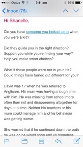
Mobile responsive email – iPhone Mail app version
This is what the Anglicare Sydney email template looked like on the Mail app on the iPhone 6.

Mobile responsive email template tested perfectly in iPhone 6 mail app

Mobile responsive emails have larger, easier to click buttons & link and readable text.

Mobile responsive email templates format as one single scrolling column
Mobile responsive email – Gmail App version
And this is what the email looked like in the Gmail app on the iPhone 6. Obviously not what we wanted.

Here is the example of how the same template showed initially in the Gmail app in iPhone.
Custom coding mobile responsive email templates
It turned out that because we had designed the mobile responsive emails in Campaign Monitor, the tool which we were using to send, these weren’t compatible with all other email clients. When discussing it with our email guru friends at Permission I was told “our developers don’t like to use template builders because that can generate extra code and be complicated to adjust on all the devices”.
So we had to update the html email code to make them responsive. Some of the things we had to fix to make the Campaign Monitor email template code were:
Anyway, long story short. We got the email templates looking beautiful on all desktop email clients as well as all mobile apps and browsers. When we’ve built mobile responsive email templates in Mailchimp we had less issues but in the future we will always develop our mobile responsive email templates as bespoke code and not use template builders.
