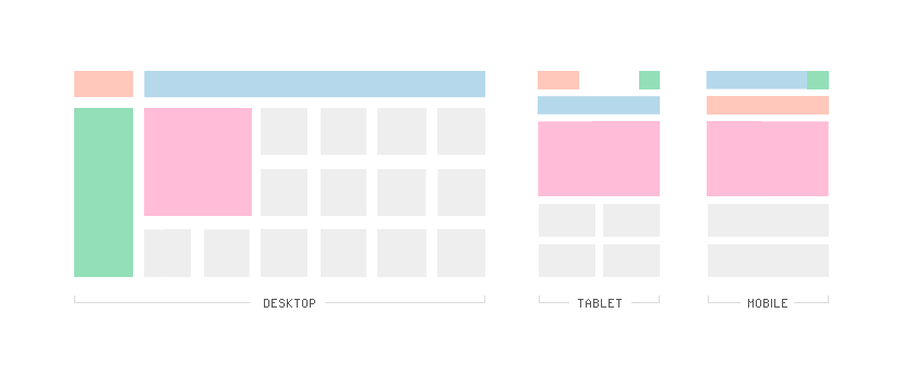
Website design has had to adapt to cater for usage on tablet and smartphones – this is called Responsive design
It’s no secret that the design and layout of websites has had to evolve with the rise of tablet and smartphone digital devices that are now connected to the internet. We’re already seeing incredible statistics of smartphone and tablet penetration in Australia, 68% of Australians have a smartphone and currently 19% of households own a tablet (which seems low to me) and the prolific usage of mobile internet access means that digital marketers and designers now need to consider the mobile user experience as a top priority. Several design concepts have been developed, the most commonly known is responsive design, which allows web designers to build a website design with specific abridged versions anticipated for the tablet and smartphone user’s experience (as show in the image above). Masonry design, which is brick- like, has also become more popular, and is best represented by smartphone and tablet app layouts. A User Experience colleague of mine, Tabitha Burke from Silkblade, says “Other examples [of how tablets and smartphones have influenced web design] are generally a simpler design aesthetic, larger text and larger buttons/clickable areas to facilitate finger rather than mouse interactions.”
I think it’s important to start this article with the statement that I am not a web designer. I am a digital marketing consultant and have been involved in the design and architecture of dozens of high profile websites and the below comments are things I have learnt over my time working with web designers, user experience architects and website developers. Most recently, I was discussing some potential homepage and webpage layouts with a user experience colleague of mine, Tabitha Burke (mentioned above), and she explained to me the Masonry grid layout. I’d never even heard of this before.

Pinterest is a great example of a Masonry layout for web and tablets
Pinterest is an excellent example of the Masonry layout because it allows for a very similar brand experience across all screens, giving the user a consistent experience on a computer, a tablet and/or a smartphone. The concept around a masonry website layout is based on arranging the content into a “best fit” model that forms a brick like layout. I assume best fit is determined by the size of the content or image and how it relates to the content around it.
The way my User Experience friend described masonry layouts to me, is that every piece of content is given equal status and representation – which is much better exhibited in the grid style layout of tablet apps – as you can see in the image below.
Our conversation about website design and responsive design that caters to mobile and tablet users was more around the trend away from a desperate need to make website designs perfectly measured and even with all available space boxed in and used. But now we see with tablets that we often have space for 20 apps to fit on out iphone screen but there may only be 6 and thus the screen is not even with 4 apps across the top of the screen and 2 apps in the 2nd line and the rest of the space blank – waiting for new apps to be downloaded. We no longer see this as messy or a waste of space, its simply space that has not yet been filled.

Tablets employ a masonry style grid layout to represent each of its apps equally
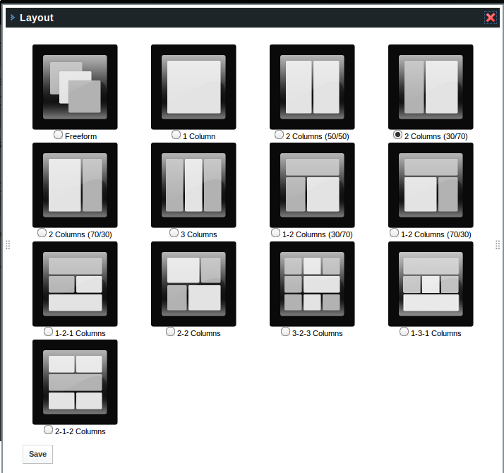
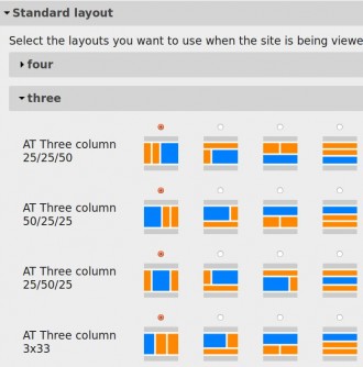
To create some context, traditional website design as I knew it throughout the second half of the noughties (2005-2010) focused most website design and layout around a 3 column structure. There are many ways these 3 columns can be displayed but it was based on 6 basic structures that we popular across research and transactional websites.
These 3 column website layouts can still be used and made into responsive web designs by deprioritising the 3rd column (often the right column) and either removing it from the tablet design all together or forcing it to the bottom of the page, which is more common on smartphones, where you see just one column to scroll and browse or read from. Now we’re seeing standard website design templates that cater to both column and grid-style layouts.

Because tablets and smartphones are so important for the brand and user experience grid-style layouts are becoming part of our standard website template layouts because they are more responsive in nature

3 column website layouts were the standard until tablets and smartphones arrived and forced web designers to think about responsive design

Trackbacks/Pingbacks