I love trying new things.
When I started parachute digital it was with this mantra in mind – I don’t want to do the status quo, I want to break new ground and try new things.
And I have. But like all things that are new and then successful, they are replicated and optimised and they cease to be new and ground breaking anymore. For some of our clients, the way we designed their eAppeals started as innovative and new but now that I’ve done a dozen appeals this way and I’ve tested the easiest variables and pushed to test the harder variables.
And I’ve just had a brave and exciting client give me a dream brief. Last week I got a call saying “I want to do something different for this year’s Christmas Appeal – if you had a blank slate and budget wasn’t an issue, what would you do?”
Needless to say I was delighted at the prospect and 3 days after that call I had a one-page diagram for my new appeal strategy – the client approved the concept and now we’re trying to work with our systems to make it happen. Not everything will get up in time for Christmas 2016 but we have a remit to start planning for the Winter/ Tax Appeal 2017 to make sure we can bring the vision to life.
I can’t share it with you, because I want my brave client to get all the kudos and competitive advantage that I hope it will bring. And if it works as I expect it will, I’ll share the case study early next year ![]() .
.
But what I can suggest are 5 tips you might not have tried for your Christmas eAppeal:
1.Pre-populate your donation form from the email click and see how it improves your donation page conversion rate.
This means that when you click on an email asking for a donation, the donation form already has your name, email address and other details pre-filled so you don’t have to fill these in again.
2. Personalised Donation thank you page.
Carry through your Donor’s name to the thank you page and put a call to action asking them to share a video or fact or infographic. The personalised first name should get more people to take the action than if it was a generic message.
It might look like this:
3. Try Give Easy’s new one click Email donation page for any donor who has donated on their platform before (to any charity).
The way it works is that an email (sent from any Email tool) is directed to a GiveEasy 1 click donation page and if that person is in the GiveEasy database, they get a pre-filled form with all their payment details stored and all the donor needs to do is click the “Donate” button.
Here is an example from the Australian Working Dog Rescue.
4. Try running your dollar handles from highest (first $ amount on left) to lowest, followed by ‘My Choice’. See if this lifts your average gift? You should get more of the highest value donations than you usually do.
Or if you have some development resources, try moving the My Choice field from the last dollar amount, to the first? See if that changes anything?
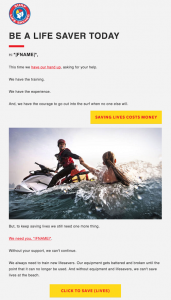
5. Use 2 x button call to actions in your email against a single button control and see if you get a higher click through rate.
Happy fundraising this Christmas – I hope you’re all as successful as my amazing brave client will be.
Please comment and let us know what seemingly weird and wonderful tests have proved insightful and rewarding.


