So true, but not so easy to design for. Plus you have to champion the user, whilst also meeting business goals.
If you have an online business, there are huge opportunities to go global. It may be a little easier to expand internationally with an online business, but its not easy. When designing a website that champion’s the user’s needs, there are many considerations (and challenges) that need to be factored in for internationalisation. When creating a user experience (UX) website design, it is very helpful to know in advance if the platform is intended to be localised for international markets.
Constant consideration for website localisation
When considering how a website’s design may need to vary between countries and cultures, we need to split our thinking into many areas. Some things are very obvious, such as language, titles and currency. This is where the average marketer or business owner can get to on their own. But do they realise that different languages have varying lengths of words to say the same thing? For instance, in German the translation of an English language word is about 3 times longer.
Other internationalisation considerations include Payment methods – which have cultural and legal implications. In Australia its very standard to pay online using a credit card but in other countries, like Japan, they are used to paying cash on delivery. In many places in Europe they make online bank transfers.
Simple things like dates and number formats that have not been localised can cause confusion. For instance is 03/10 the 3rd of October in Australia or the 10th of March in America? Prices can cause confusion if not accurately updated for each region. For instance a digital marketing strategy that Parachute Digital offers for $1,520.50 in Australian dollars would be translated into 1.520,50 in Germany but 1 520,50 in France. A comma or full stop in the wrong place can be very misleading.
Phone numbers and address details in forms need to be correct as this is the most likely place for shoppers to drop off if the user experience is not well designed. In Australia we break up our mobile phone numbers into three groups of 4, 3, 3 digitals, such as 0400 040 345. But in America they call ist a cell phone number and the convention is three groups of 3, 3, 4 digits, and the first three digits are always the area code in brackets such as (303) 507 9845. In the UK the format changes to two groups of numbers in a 5, 6 sequence, such as 07826 157200. What has become standard is the international prefix, represented as a +61 for the country code.
There are variances for post codes or ZIP codes, for units – such as centimetres or inches and symbols for currency such as $ dollars, euros, pounds or yen (which are harder for me to represent on an Australian English keyboard).
Hierarchy of UX Website design considerations

Human behaviour varies across cultures. UX website designers are the best placed to interpret these variables when designing a website
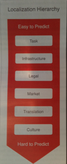
Giles Colborne from CX Partners created a Hierachy of Localisation for UX design that I think best articulates the areas for consideration and where they sit on a scale of easy to hard. I first saw this in the book Smashing UX Design.
As the Hierarchy illustrates, the tasks that users aim to perform online are fairly universal across cultures. If a user is trying to buy some moisturiser, find someone’s contact details or book a flight, the requirements are fairly similar. So when designing a travel website for international audiences, the information people need to go through the search and decision making process is the same.
Infrastructure can affect our technology options and how people use websites. When CX Partners use the word infrastructure in this context they are talking about broadband speeds and private or public computer networks. Basically, we’re talking about access to the technology. Is this from a mobile phone or a work computer?
Your countries infrastructure won’t affect what open source content management system (CMS) you may choose, but it will impact whether or not you offer live streaming video to your users or images that will chew up large amounts of our mobile data to download.
Every country has its own laws and therefore your website terms and conditions will need to accurately reflect the country you’re operating in. I mentioned payment details above, but there will be differences in taxation on products, consumer rights, spam laws and guidelines around what data you can collect online.
Now we start to get into the more subjective, harder cultural and behavioural elements that can impact on the success of your website design. Understanding your market is something you can only get with time and experience working in that market. We have all been part of teams where a new person has been recruited into the team because they have experience of the industry or knowledge of a market. In Australia, if some of our key stakeholders are in Japan, having someone who understands their cultural expectations can reduce awkward and unwanted situations arising.
In Australia, we tend to bundle things together because the consumer has the impression that if they buy a number of products (be it insurance or mobile and internet access) they will get a better deal. Similarly, in some countries automative manufacturers will promote the baseline model in their marketing and advertising, with the lowest price point. When in other countries the top of the range model will always be shown. Online retailers in America pretty much offer free shipping as standard whereas in Australia retailers use postage and handling as an additional product and revenue stream. We are used to paying higher prices for products because of our geographical location, often at the other side of the world, so even when its a local delivery, we don’t question a delivery charge because it is normal. In the hospitality industry in Australia drinks are measured in 30ml shots whereas in America drinks are often free poured by feel and sight. At fast food restaurants, free drinks refills are expected in the USA but in Australia this is still not standard. Australians love a TV jingle whereas this is not well received in the UK.
I think you get my drift. We want to make sure we operate in the “normal” space so as not to alienate our new market.
I referenced language translation above. We know that many languages of European decent read left to right, but the number of letters in a word, or words in a sentence, or grammatical structure of a sentence can vary in length. But in some Asian countries, such as Japan, their language is written in vertical columns whereas Arabic and Hebrew languages are read from right to left. This is just the logistics of language and how it can affect a website’s design. It is really in the subjective, subtleties that we can come unstuck. The tone of voice used, how formal or casual the language is, the intention behind the words can get us into trouble if they’re not translated correctly. The last thing we want to do when we’ve launched into a new market is offend our target audience. We have to take care to translate the meaning, not just the word.
And finally we have culture, which is very hard to understand unless you’ve lived it. That is why its so important to test your website design and content with users from your intended markets. You may know that certain symbols or images have significant meaning in some cultures, such as the Swastika – which is a sign of evil and hate in many European countries but in India it means good luck. Colours are often used to represent different emotions or feelings, animals and icons are common mascots in Asian countries whereas they are considered immature and distracting in Australia. Australian, UK and American websites tend to prefer a lot of white space, with short headings and paragraphs whereas Asian countries love what we would call clutter.
These things don’t even begin to touch on issues of morality, religion, humour, manners or politics. As you can imagine, these things can represent a mine field for the uninitiated. So if you’re going to expand your business into international markets, make sure you do your due diligence first.

Insightful article. Thank you. I would definitely give more preference to “Content Strategy” and emphasize on understanding the target market. I am glad you mentioned about language translation.
Hi Anna,
Thanks for your comment and apologies for the delay in replying to you.
It is surprising how different the same word or sentence can be across languages, isn’t it?