Part of what I do is enlighten businesses about how they can use digital systems and technology to streamline their operating processes, automate their systems and reduce their costs through creating virtual experiences as well as eliminating the duplication of effort that is often created with old-school paper processes which require uploading and downloading and cross-referencing and entering information into 3 places – not to mention the human error occurrence. The smartphone is an example of a very simple, practical, affordable piece of technology hardware that businesses can leverage by using existing developed applications to change the way they do business, to become more efficient and in some cases, innovative. That is exactly what MONA has done.
Last wee my husband and I visited the incredible Museum of Old and New Art (MONA) in Hobart, Tasmania. This place is not only an incredibly feat of modern engineering and sustainable architecture, a symbol of creativity (and commerce) but it is also using technology in inspiring ways.
Introducing the O Device
The ‘O Device’ is the interactive, electronic gallery guide at the MONA. When you walk in the doors, you’re handed the O Device (which is just an iPhone that some smart administrator of the gallery has had an app developed for) and given a 1 minute training session for how to use it.
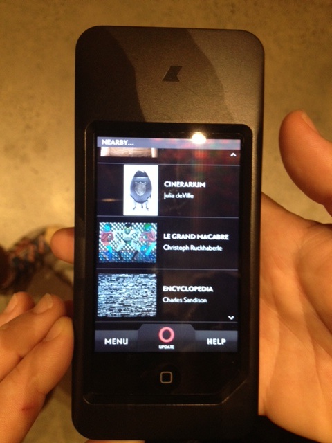
The MONA O Device used the iPhone’s GPS native functionality to locate your exact position wtihin the gallery and delivers a list of the artwork that surrounds you so you can find out more information about them.
But the really cool, but so simple thing that I loved, was the way I had to use my O Device to search for the artwork I wanted to know more about. And I’m so sorry but unfortunately I didn’t capture a picture of the screen for the search location function, but as you walked through the Museum of Old and New Art, which they tell you to do from the bottom to the top (just to be different), you can activate your O Device any time you find a particular piece of artwork that you want to know more about, and it will use the iPhone’s GPS native functionality to locate your exact position within the gallery and deliver a list of all of the artwork within a 20 metre radius of where you’re standing (I’m guessing on the radius). But I did get a picture of the location search results (below).
The O Device is the interactive, electronic guide for the MONA in Hobart, Tasmania
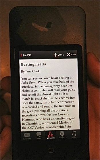
You would then tap the artwork that interested you and get five tabs at the bottom of the screen which allowed you to explore as much or as little as you liked about each of the artworks.
- Summary – obviously the title and a little bit of info provided by the MONA curator
- Ideas – these were usually quotes or short statements that gave a little insight into the inspiration for the artwork
- Art Wank (my husband’s favourite) – this varied from one piece of art to another (the tab didn’t exist if there was no content to support the artwork) but it was usually a professional critique or review and sometimes the artist’s own words about what the art means to them, what inspired it and perhaps what they hope the person who views it will think and feel
- Gonzo – this tab usually housed a visitor’s comment or an article written by an admirer (or detractor) of the art
- Media – audio files of interviews with the artist where they had the opportunity to talk about their art (this tab also disappeared if there was no content to populate it).
There is also a LOVE or HATE voting mechanism where you can tell the MONA administrators which artworks take your fancy and which don’t. So not only does it create and engagement opportunity with the consumer, but it also provides valuable market research about which art specifically is liked or loathed by visitors. This data is live and in real time, so they can see if trends change over time. It sometimes bothered me that I could only LOVE or HATE something, so if I fell somewhere in the middle, I just didn’t comment, and that in itself probably speaks volumes to an Art Curator.
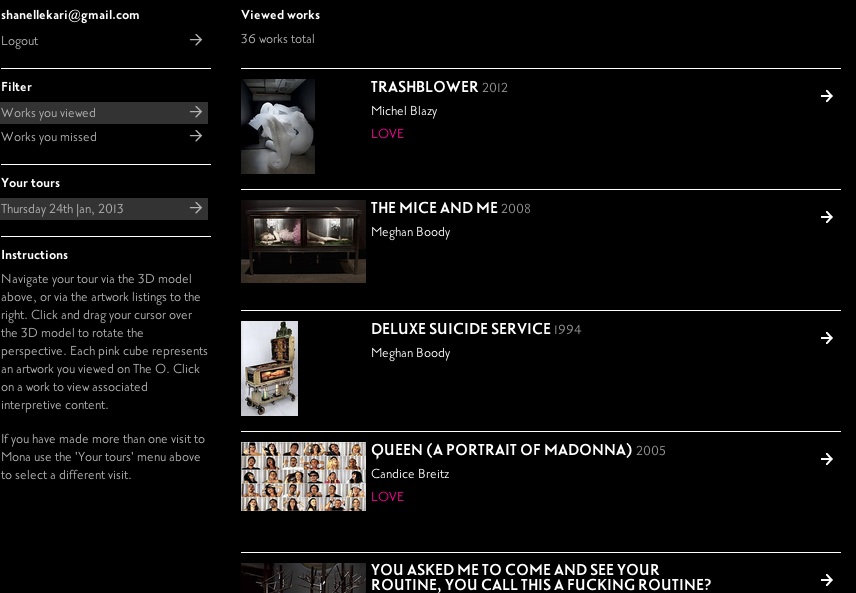
My personal tour of the MONA artworks and how I rated them for me to revisit online.
And then MONA go even one better and allow you to enter your email address and save your personal MONA tour online so you can visit it later. The artworks I viewed information on, the artwork I missed, the ratings that I left as evidence of my visit. This is the ultimate slide show for those who want to relive it in detail and show their friends and family.
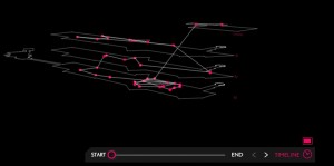
The actual route I took through the MONA
Isn’t this amazing? I know a lot of people like to walk through a gallery the old-school way, where the Title, Artist and Summary of the piece are located next to the artwork, but this way is so much better because it reduces the traffic jams you get while people stand reading the wall and obscuring other people’s view. This way, you can listen and read about the art as you’re walking through or you can just appreciate the experience and when you go back up to the top and sit in the cafe waiting for your husband to finish you can continue to browse and learn about the artworks through a more traditional smartphone search function.
I’m sure many of you have seen cafe’s and restaurants that use iPhone’s to take orders and payments (click here to read more about Google Wallet and mobile MCommerce) or you have ordered a taxi through your mobile app or a pizza via Domino’s world renowned iphone app. These apps, which are no different to what MONA have created with the iPhone, they’ve just decided to brand it the O Device (which I’m not sure what it means – perhaps one of my readers can comment with the answer), are changing business and operating procedures. They’re automating our systems and giving the customer a hassle free, immediate, positive experience AND they reduce the business overheads.
So tell me again why so many businesses are so fond of their paper processes? And please, tell me you don’t want to visit the MONA now?

Loved this post. Thanks Shanelle!
You’re very welcome. It’s amazing how powerful your phone can be when its used to its full potential. Apparently it would be the most powerful computer in the world in 1985. How far we’ve come.