After eleven years of planning, implementing and analyzing the results of digital marketing and fundraising campaigns, I have learned that there are four fundamental elements that are essential for success online. I like to call these the 4 Digital Fundraising Fundamentals.
An appeal or campaign may strike it lucky with only three of these elements but this only occurs if there’s a great public outcry or momentum for an issue that it wouldn’t have mattered who received the message or how clunky the online experience was, people will persevere.
The four digital fundraising fundamentals are:
- Making the user experience as quick and easy as possible
- Creating digital content to tell a compelling story
- Using data and behavioural analysis to target the right people for your message and
- Integrating your online fundraising campaign with your offline fundraising and marketing communications.
Make it a great online experience
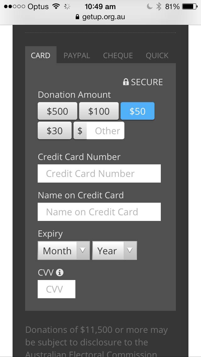
Developing a great online experience for your supporters and donors is really about paring back and keeping it as simple as possible. Donors love online because it is convenient for them – they want to be able to access your information or appeal while they’re on the go and they want it to be quick and easy to complete the task you’ve asked them to do (donate, subscribe, sign a petition etc.).
Keeping things simple is often our biggest challenge because as marketers and fundraisers we always have three objectives; 1) Get an action/ donation right now to hit our appeal target and 2) Get as much information as possible so we can better target and segment future communications and 3) Inform the donor of the issues. But quick and easy often means keeping the content and the form fields to a minimum, making it hard to achieve our second and third objectives. We have to be patient and build our relationship and gather data over time.
The WSPA Live Export campaign has created a great desktop experience but the site hasn’t been optimized for mobile devices. The UNICEF Australia Philippines typhoon disaster relief campaign appeal page has a very quick and easy mobile and desktop experience. If you donate by PayPal then the quick and easy experience continues, but if you want to donate by credit card the form is perhaps a little too long and onerous.
But if you look at Change.org’s petitions such as the Stop Dumping on the Reef or GetUp’s “Chip In” campaigns, both of these sites have excellent mobile and desktop user experiences making it very simple for their supporters to be able to act and donate to the causes they care about.
Using content to tell compelling stories
It doesn’t matter how great your online user’s experience is if they don’t connect with the message you’re trying to convey. People support a charity because the cause they work for matches the donor’s individual values.
Personally, I care about the Environment, about human rights and social justice and about reducing poverty and homelessness (as you might have been able to tell from the examples I used above) – so I tend to donate to organisations that work in these areas. However, there are hundreds of global and local non-profits and charities that fight for these causes – only a few of them will be able to win me over.
The way that they do this is by engaging me with a compelling story like War Child did. As I start to explore more, I read dozens of stories, mostly told through images and personal stories, interviews with quotes. I want to see more video but these stories are from places that are dangerous, where people live in refugee camps and phones and camera’s that take video are almost unheard of. There is the occasional video that tells a story that starts off familiar to me and makes the cause relevant to my life – then it hits me with the facts and I’m enraged and upset and then it gives me a clear call to action that I can do right now. That is the point of inspiration, where they’ve got me and I’m ready to donate.
Stories are made more compelling with design – War Child have mocked up a box of crayons, an image I recognise from my childhood, but it’s filled with bullets. It makes me feel sick and that’s the desired effect. I need to have a physical or emotional reaction if I am to be compelled to take the next step into action.
Use whatever you can get your hands on to tell your organisation’s stories. But it’s important to focus your energies on telling the stories that donors respond to most if you have financial outcomes to meet.
Use web analytics to monitor your supporter’s online behaviour
A lot of my digital fundraising consulting work is based around getting organisations to look at themselves from the outside in. We get so bogged down in the details of our work and the outcomes we’re trying to achieve that we sometimes forget how our supporters perceive us, what is most important to them that is generally what drew them to our cause in the first place. In the online space, we can track and monitor every click, comment, download, donation and page view – that means that we can determine, without much room for error, what your supporters care about most and what stories will be most successful and should be used for donor engagement and acquisition campaigns.
Your organisation may work across a dozen key areas – all of which you’d ideally like to promote to supporters. But not all of your work will be interesting to the majority of your donors. Fundraising needs to work to the majority, not a minority – this can sometimes be a difficult conversation to navigate internally. Web analytics and data can help you put forward a case for what your supporters care about based on how they interact and behave online. The conversations and comments your organisation receives through websites, social media and interpersonal contact can provide evidence as to how your supporter’s think and feel – answering the “why” questions you will be faced with. This can help you shape content and stories that will reap the highest engagement and financial returns.
However, like every piece of data, these assumptions and decisions need to be analysed and tested. When I was at WWF our page on the Great Barrier Reef was by far and away the most popular page on the website when it came to people arriving from search engine traffic. So in line with the above comments, you would think that the Reef would be a great fundraising campaign too then, right? As it turns out, no. WWF had tried unsuccessfully for years to raise money on the plight of the Reef’s steady decline but donors weren’t that interested. So I already knew that I was missing an important correlation.
When digging deeper into the data, I could see that most of the people who visited WWF’s Great Barrier Reef (GBR) page were bouncing off the page without spending much more than 10 seconds there – that is a sign that the user has not found what they were looking for. I was also able to establish that the visitors to the Great Barrier Reef page were largely from countries that were not Australia. We were able to establish that the keywords people were typing into Google to find information on the GBR had a tourism skew. So it was great that WWF’s GBR page was ranking very well in Google’s search results, but these visitors were not looking to donate, but to visit the reef as a tourist.
Web analytics don’t lie, but they can only tell you WHAT your supporters are doing online, not WHY. You have to apply your own level of human analysis to properly determine which data sets are valid and which need to be set aside.
Online will work harder for you when integrated with your offline fundraising
This final point is really quite simple. Integrating online into your overall fundraising mix will lead to greater efficiencies for your organisation. Using mobile marketing tools to make it easier for your Face-to-Face fundraising teams to capture new donor details and take their first gift on the spot to validate the credit card also generates higher revenues and provides better data management. On top of this, sending your new donor an SMS message with a video as soon as they walk away is helping to reduce the steep drop off rates we often see in the first two weeks after a new donor has been acquired.
Using short and friendly vanity URLs in your direct mail communications, to send donors online to give means that you have the opportunity to get the money straight into your bank account and the thank you letter and receipt is automated, reducing manual processing and printing and postage costs.
The Zero Moment Of Truth (when people see something on TV or in the paper and immediately reach for their phone or tablet to get more information online) that is irrefutable in the retail sector will also benefit organisations that are investing in Direct Response TV. Having a mobile optimised campaign-landing page with an easy to remember URL means that prospective donors can act in the moment of inspiration and immediately donate via their mobile device.
If you can think of a reason why integrating your online and offline marketing and fundraising is not a good idea, please comment below.
Obviously for your digital fundraising to be a success, you have to make it a priority, invest the time and effort into building the content, developing a platform and systems and processes that will get your organisation ready to do business online but I promise you, if you follow these four digital fundraising fundamentals – you will see wild success before long.


