There are dozens of factors to consider when planning your email communications strategy – there is the design of the email,the email content, spam compliance, marketing acquisition tactics, retention tactics, tracking, reporting & analysis but today I’m going to focus on 3 areas only:
- Design
- Content
- Spam compliance.
When designing your email – whether it be a regular information newsletter to your customers or a more focused, single minded acquisition eDM (Electronic Direct Mail), you always need to consider the following elements:
- Most webmail products (Gmail, YahooMail, Hotmail) and software email tools such as Microsoft Office Outlook & Entourage and Mac Mail, now default to “Images are not displayed”. Good email design takes this into consideration and ensures that text is included to explain each image as well as a content section at the top of the email to help the user understand what your email is trying to communicate, without relying on images or graphics.Of course you can click the “Display images” link or button every time you receive an email or you can change your settings to “Always display images”, but an email marketer still needs to consider that many users will not see images immediately when they open their email.
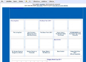
Below is an example of the Ticketek Australia weekly newsletter, which is heavily reliant on images. As you can see, there is text that lets you know what each of the image boxes is likely to contain, but it doesn’t make for an exceptional user experience.
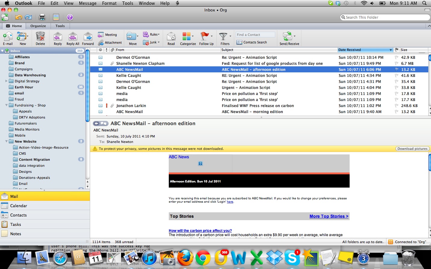
- When designing your email newsletter or single minded eDM you also need to consider the preview window. Again, my email tools including Outlook, Entourage, Mac Mail and YahooMail, all offer some form of preview window for users to see their inbox and view an individual email at the same time. Often this preview window is what helps the user make the decision whether or not they wish to open an email or delete it. This preview window can be horizontal, at the bottom of your email window, or it can be vertical at the side of your email window. See the example above to the right.Good email design must allow for the preview windwo and ensure that at the very least, the top header section of your email includes a content section so that the user is always able to understand exactly what your email is trying to communicate. This is important for two reasons. 1) because the information will act as a summary for the email content below and 2) the email can communicate without relying on images or graphics.
The content of your email is the most important element and should be mapped out in an email communications strategy and planned in advance so that the user gets a user journey that is cohesive. The absolute degree of detail you undertake in planning depending on what your product is. For a charity, the first 2 weeks of a potential new donor’s journey is pivotal to their experience with the brand/ charity and directly impacts their likelyhood of becoming a regular donor. For a retail brand that might be emailing sales and promotions, this first 2 weeks is still very important to establish the expectations of the new subscriber but the long term relationship is more likely to depend on the product itself and the user’s needs and wants.
- Email content should be planned in the same way as website content. The sentences should be short and to the point. Paragraphs should follow a similar format, staying short – try to keep them to about 5 lines each. Use sub-titles throughout the email so that the user can skim the content and find the information that is relevant to them easily.
- Don’t be afraid of brevity or of white space – if you only have 3 stories to tell, that is fine. So fill your newsletters with fluff just to make them look long and important. This will not assist you in your end goal.
Finally, for your emails to be spam compliant it only requires a few simple, but fundamental, elements:
- When acquiring new subscribers through your website, you must display a disclaimer with a link to your company’s Privacy Policy
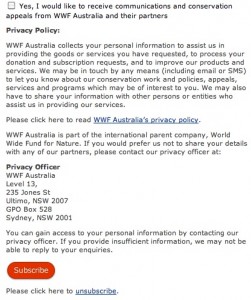
- Underneath your privacy policy and disclaimer, you must have an opt in box with confirmation statement saying that “Yes, I want to receive emails and news from [insert company name]”. This box can be pre-ticked or not, but unless the user ticks this box to confirm that they want to receive emails from your business, you are not legally allowed to email them.
This is where many businesses get it wrong. They acquire email addresses on paper forms or at events or on order forms where the user is providing their email specifically because of a purchase or order and then find themselves on a regular mailing list that they did not intend. Below is an example of the email opt in and disclaimer.
- The final element required for spam compliance is an unsubscribe functionality. The unsubscribe link must be on every email a business sends. It must allow the user to email an unsubscribe request or preferably, it should be automated so that when they hit the unsubscribe link, they are redirected to a webpage confirming that their unsubscription has been received and they will no longer receive emails from your company.
As you can see from the above, planning and designing your email communications strategy can be a fairly simple exercise. Acquiring new email subscribers is the easiest part of this equation, retaining them with relevant and interesting content, that is displayed in a format that make sense for this medium, is far more challenging. But its an exciting challenge and a rewarding one if you get it right.
In such a cluttered space, a successful email strategy will definitely make you stand out from your competitors.


Thanks, it’s very informative