If you’ve read our latest work –Researching Charity Donation Pages 2.0, then you’ll know there are many things you can do to improve the experience your supporters have when donating through your charity website.
Improving the conversion rate of your donation website isn’t going to happen overnight. However, here are some simple changes you can make this week that will make an improvement.
Just how easy it is will depend on two things:
1) How your charity website is built (with or without a CMS like WordPress) and,
2) Who makes the changes (it could be you, a tech-savvy peer, an outsourced developer, etc). But in most cases, if someone with enough knowledge does it, you can implement all 5 changes in a week (or even less if you’re really keen).
1. Visual security hint
Of course your payment process is secure. You know it and I know it. But, does your potential new donor know it? If you’re asking somebody to give you their credit card details online you have to make them confident that you’re going to keep them safe.
According to our research, many organisations are still not doing enough to make their donor’s feel that their data is safe and secure.
Here are two simple steps to make your donors feel confident when donating online:
- If you’re using a secure payment service add their logo near the “Donate” button.

Caritas secure form
- If your payment is secure, but you’re not using a recognised secure payment service, simply add a lock icon near the “Donate” button along with copy stating “Secure payment”.
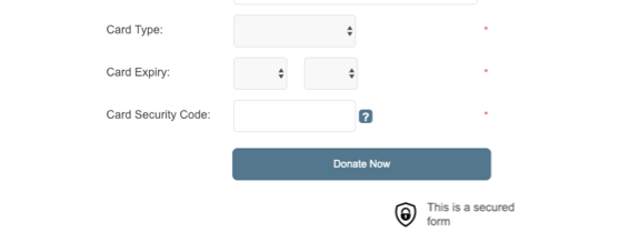
Angilcare security hint
2. Video on Thank You page
You know that when you make an online donation, you feel good. That’s thanks to your brain releasing a burst of serotonin. Don’t just leave your donor feeling good – make them feel awesome and included. Show them how they are helping and how much you appreciate them with a thankyou video.
It doesn’t have to be fancy, you could even shoot one on your phone – test it and, if you can, track the views, you’ll be surprised by the engagement level it will have, mark my words.

MSF has a video on their Thank You page
3. Name on card field = Name + Last Name fields
This is the quickest win of all. In the credit card information section, you must include the field for the name on card. This is because there may be cases in which the donor and the credit card holder are different people.
However, most of the time they are in fact the same person. This means you can streamline your online donation processes. Just update the “name on card” field when the “name” or “last name” fields are modified (or carry these values on to the next steps if it’s a multi-step form).
And if the donor is not the credit card holder they can simply change it!
4. Some basic validation
Only 33% of the charities we assessed for the report are validating data like phone number and postcode. Why are you even asking for it if you’re not sure it’s correct? Here are three quick fixes to improve the accuracy of your data:
- Check the postcode has 4 characters and are all numbers,
- Check the phone has 10 digits and are all numbers,
- Check the email at least contains an “@”.
After you implement this, don’t forget to show the proper error message when validation is not met.
How would this improve your donation page’s conversion rate? Validation not only provides better quality data, the overall online donation experience improves when you are very clear on how you want the information to be entered.
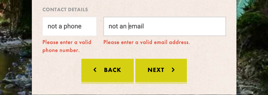
Environment Victoria has a nice validation
5. Use the right keyboard on mobile
Don’t you love it when you are filling a form in your phone and your keyboard reacts to the type of information you have to enter?
Well, your donors will surely appreciate it too. Give them a numeric keypad for their phone number and credit card details and show the “@” when you’re asking for their email. And it’s not hard to do!
Let me tell you a secret. All that you (or your web developer) have to do is specify the “input type” and the browser will do the rest.
Given the increasing importance of mobile online donation this is something every charity donation website should implement (and it’s super easy!).
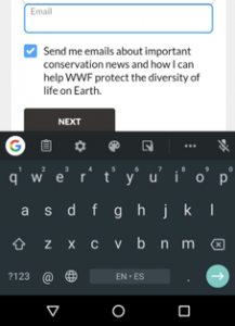
WWF Australia keyword for email
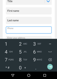
WWF Australia keyword for phone
BONUS: Different dollar amounts for one-time vs monthly donation
I’ve put this final tip as a bonus because it may not be as simple as the other ones to implement (depending on how you process your payments). This could be your next step once you have the first 5 quick wins in place.
If you use the same dollar amounts both in one-time donations as well as in monthly donation, one of them is likely to be failing. You’ve probably defined your dollar amounts with one of the options in mind, leaving the other option too high or too low in consequence.
It also gives you the opportunity to tell the donor more about the great work you are doing – $25 a month can provide schoolbooks for the year / $1000 can build a new classroom – you know what I mean. Make each dollar handle unique and use different images if you can too.
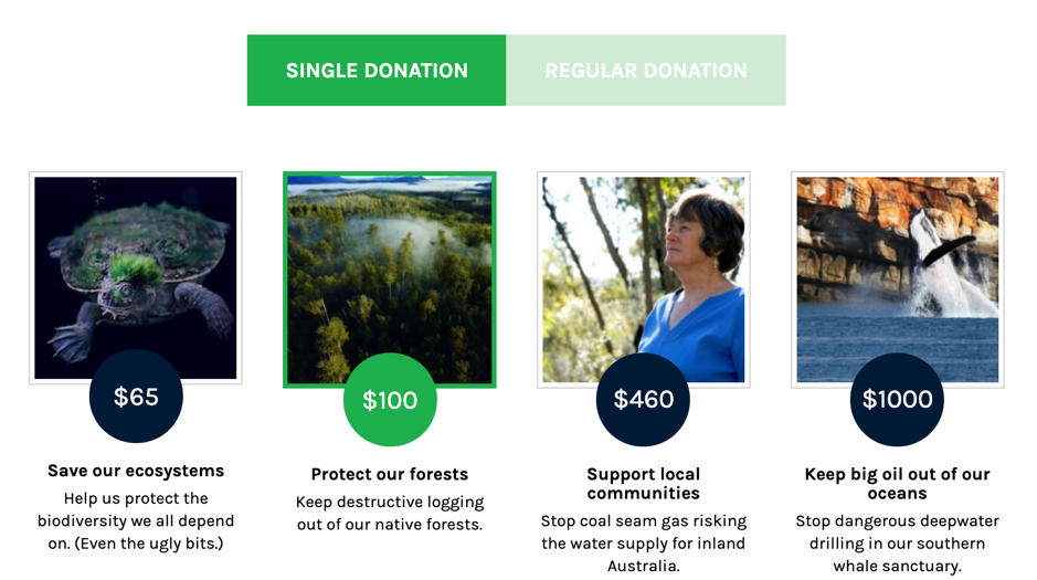
The Wilderness Society dollar amount for Single Donation
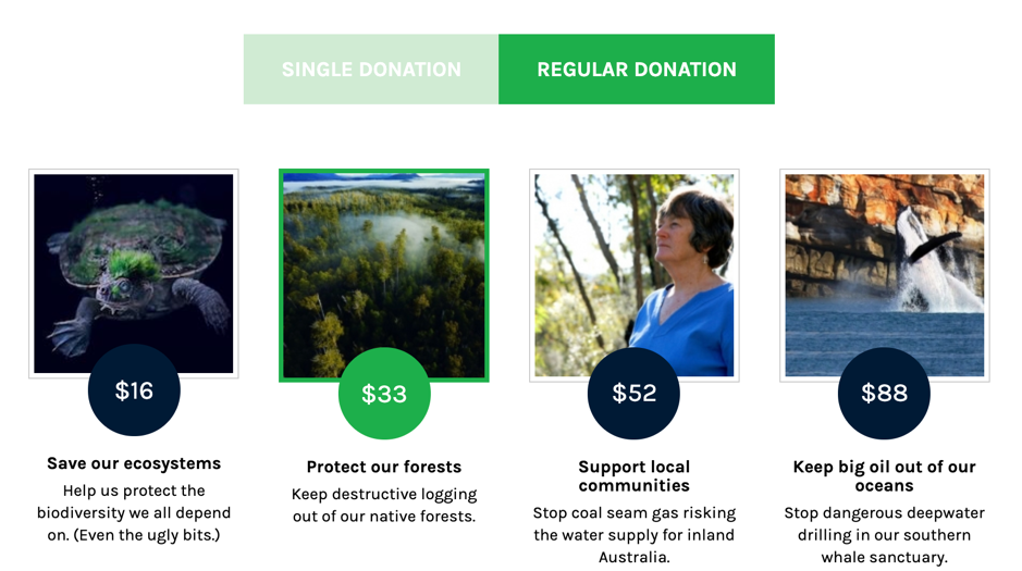
The Wilderness Society dollar amounts for Regular Donation
I really hope this helps and would love your feedback – tell me in the comments what changes you’ve made this week.
